This is the first post in a series that will discuss ideas, give tips and show what we are doing to help people navigate around our church.
One of the most important things for a guest or anyone in your church to help them navigate is a good map which shows where things are.
We’ve created three specific maps for our two services on Sunday and Wednesday night activities.
Our Wednesday night activities map is below.
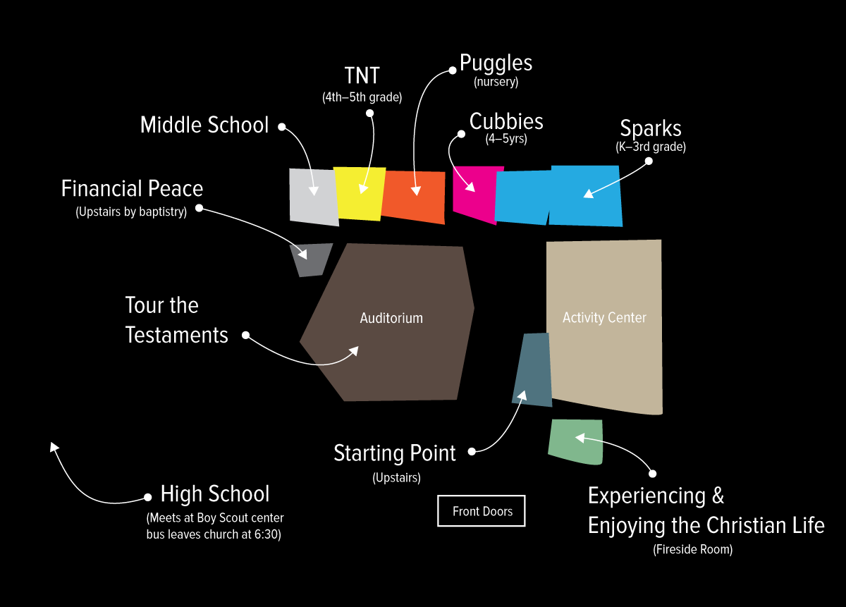
I had three goals for our maps.
Keep it Simple
Nobody needs to know exactly where the janitor closet is and no one cares where the Awana ball room is. We only needed key areas for orientation like the front doors, auditorium, and activity center.
I then added each relevant classroom. Not every room is on the map because not every room needs to be there. These are the major areas.
Keep it Clear
On the map itself there are no descriptions of what each class or room is. If needed you can put those in a key below. I also color coded each room for greater clarity. I could have just used the boxes with arrows but adding in color differentiated the rooms and gives a lot of visual contrast to point people in the right direction.
Make it Not Boring
Originally I had a blueprint layout of the building which wasn’t very fun. Also not fun is listing each class next to a number. I found the visual key was to use the actual layout of the building and then throw in a fun graphical twist.
We use these in poster frames at key areas in the building, as handouts for new guests and on standing kiosks when a guest first enters the doors.
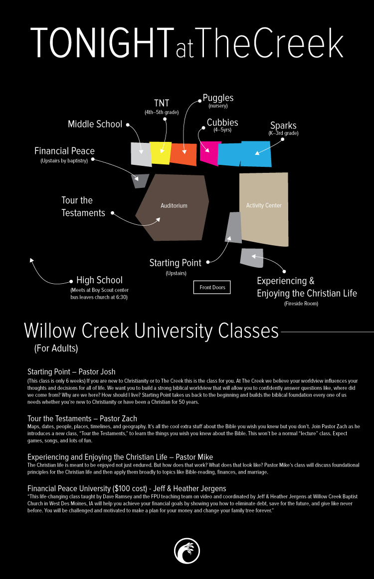
Poster maps on walls
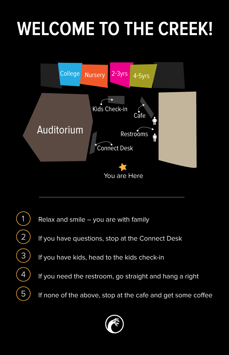
Kiosk maps